I lead the creation of the widget store from 0-1
3 key usage data analysis
Survey with 2,500+ global users
Collaborated with 3 strategic partners
3 major design/product feature upgrade
Refine design solution with 3 workshops, engaging 4 departments
MVP generates over 1 million ARR
Established 3 fundemental ecosystem partnerships
My Role
Product Manager, Product Designer - Global Product Planning
* Everything presented here is originated, designed, produced, and managed exclusively by me
Broader Context
Widget, the atomic units of mobile services
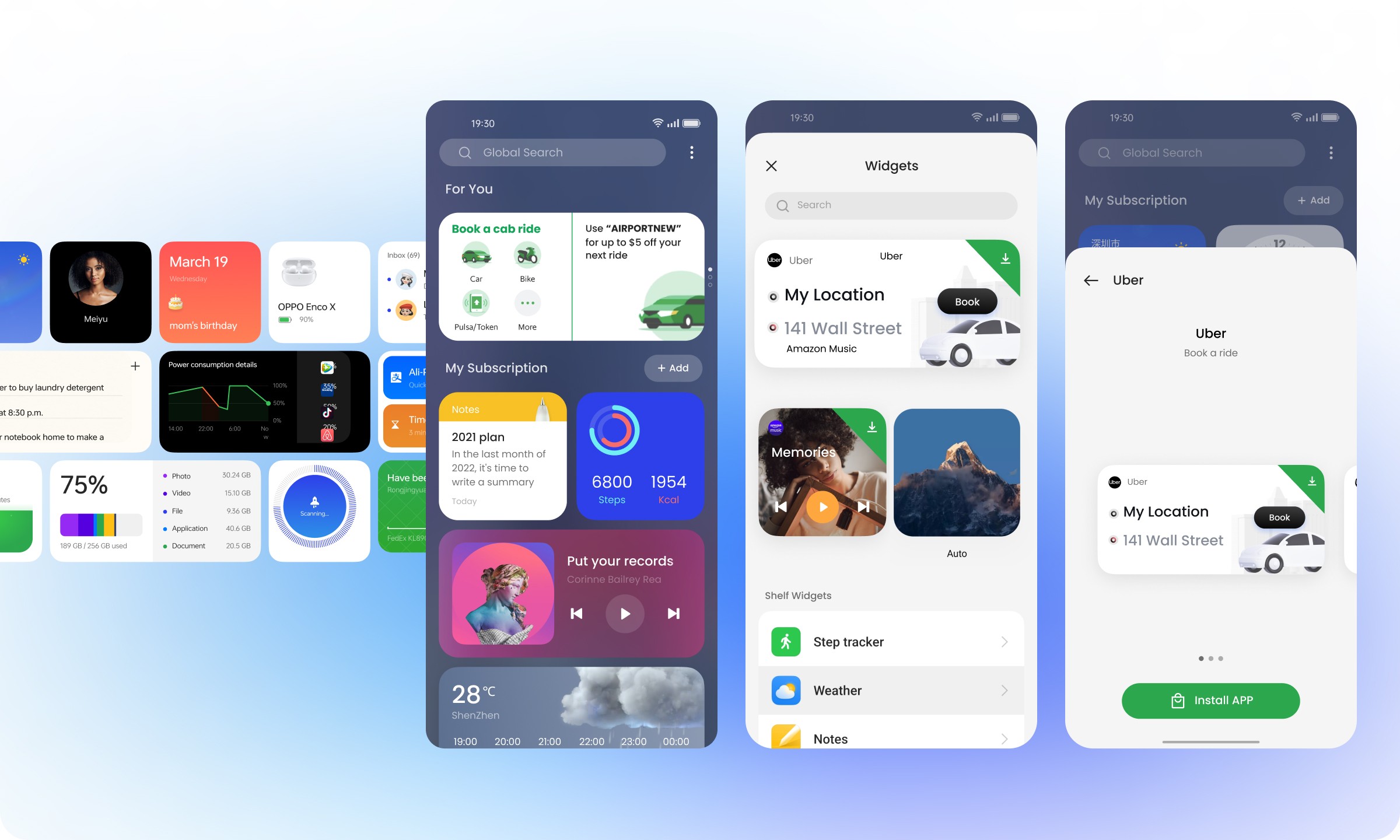
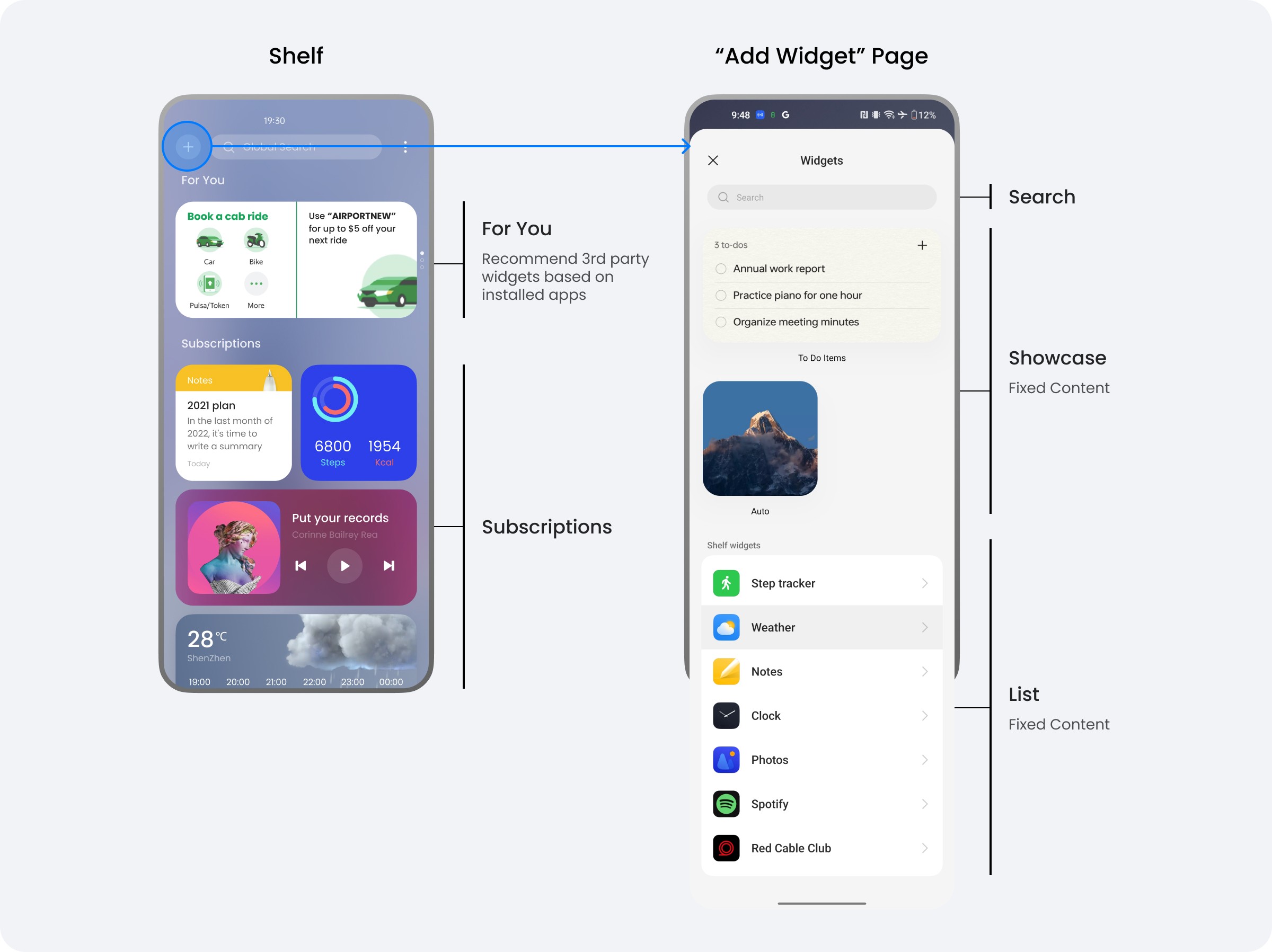
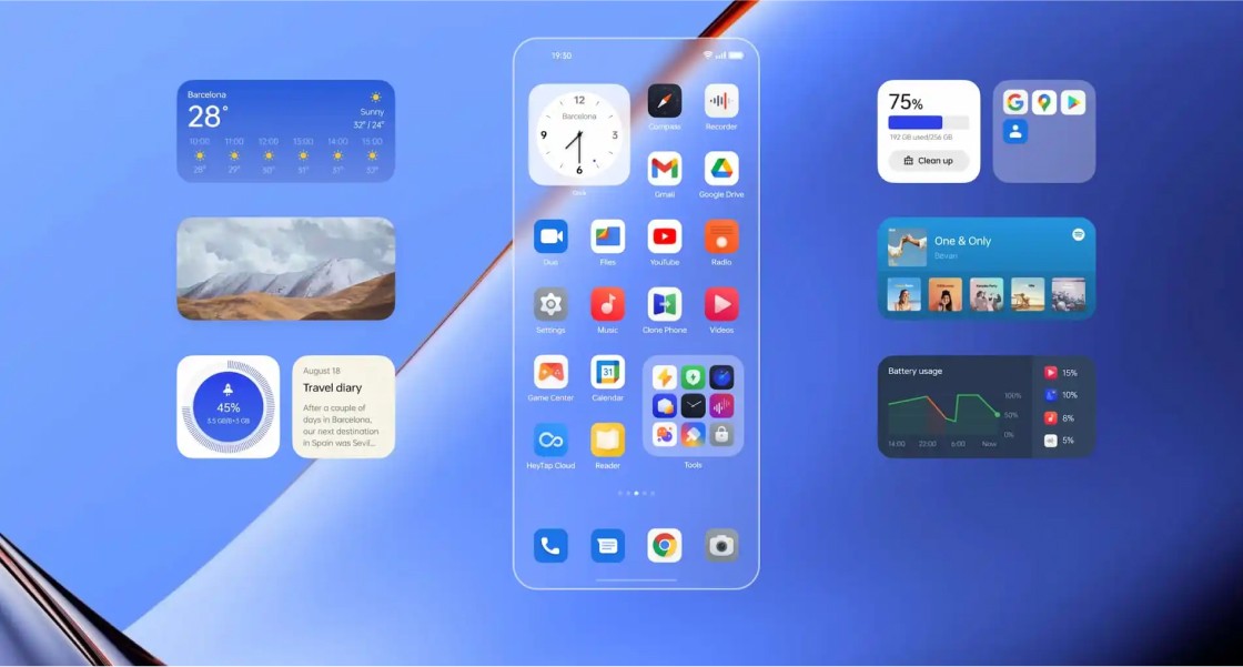
Widgets offer hyper customized content, direct access to services, adaptability, and will play a crucial role in LUI in the age of GenAI. Shelf was launched on ColorOS 13.0, serving as a specialized hub for widgets, which can be reached by downward swipe on the screen.
Challenge
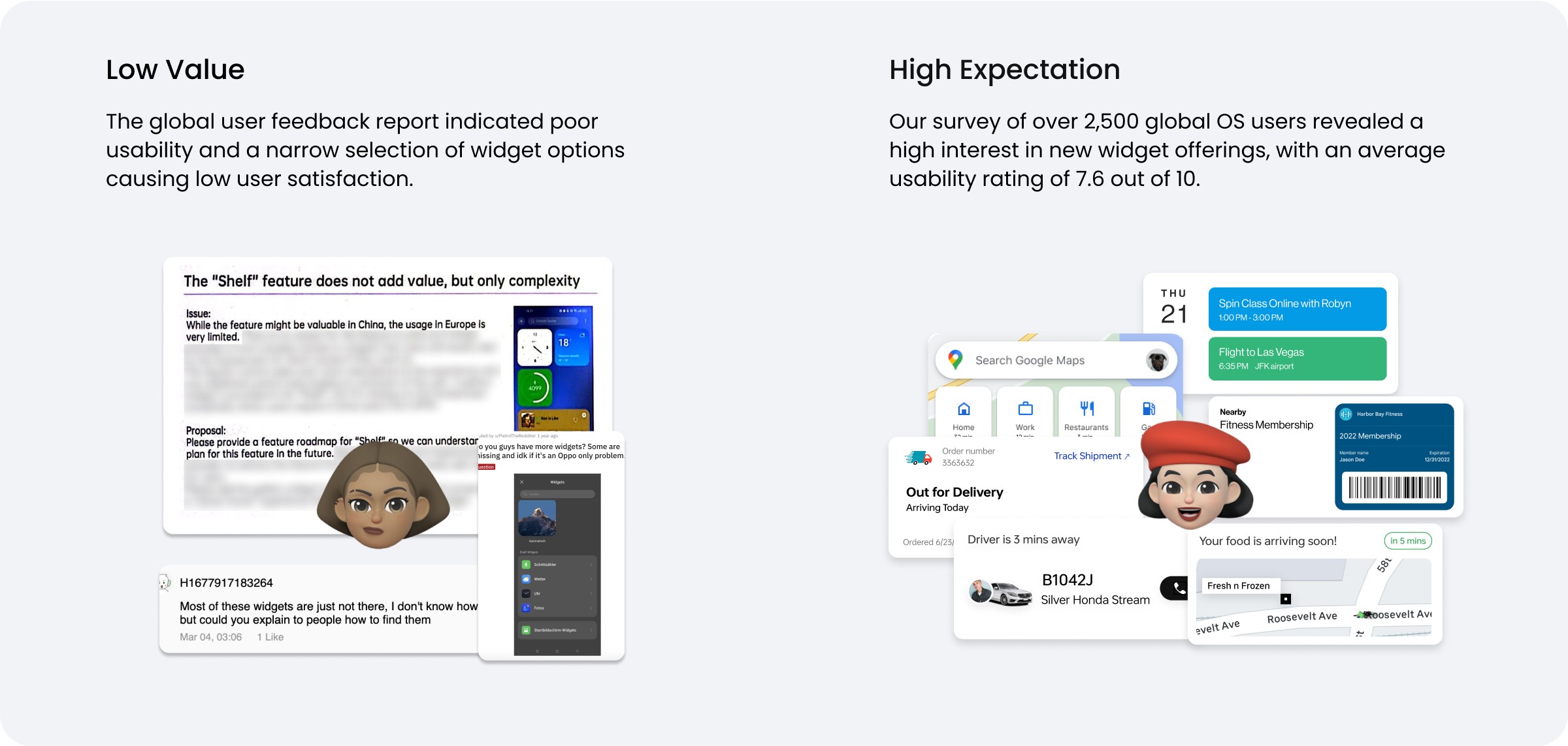
User feedback shows Shelf and Widgets did not add value
Problem Define 1
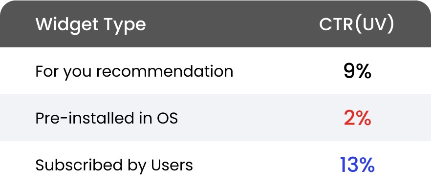
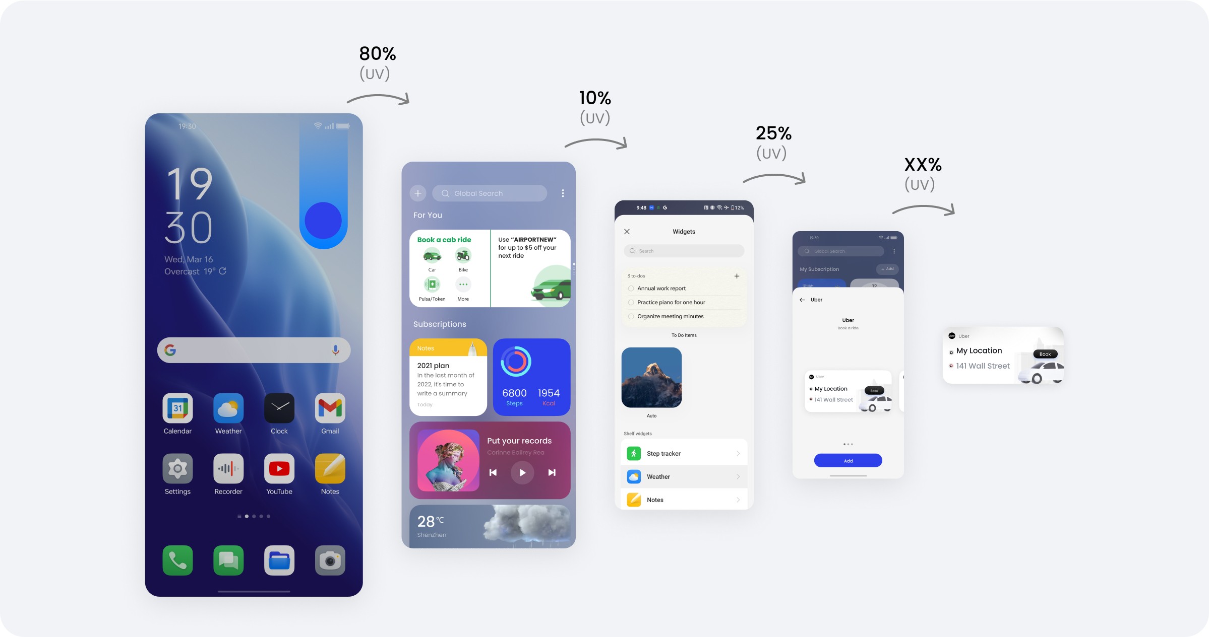
Diving into data, users who actively subscribe to a widget vs served a recommended widget have a 6X higher click through rate (CTR) conversion
However, Only less than 1% of Shelf users actively subscribed to widgets
Problem Define 2
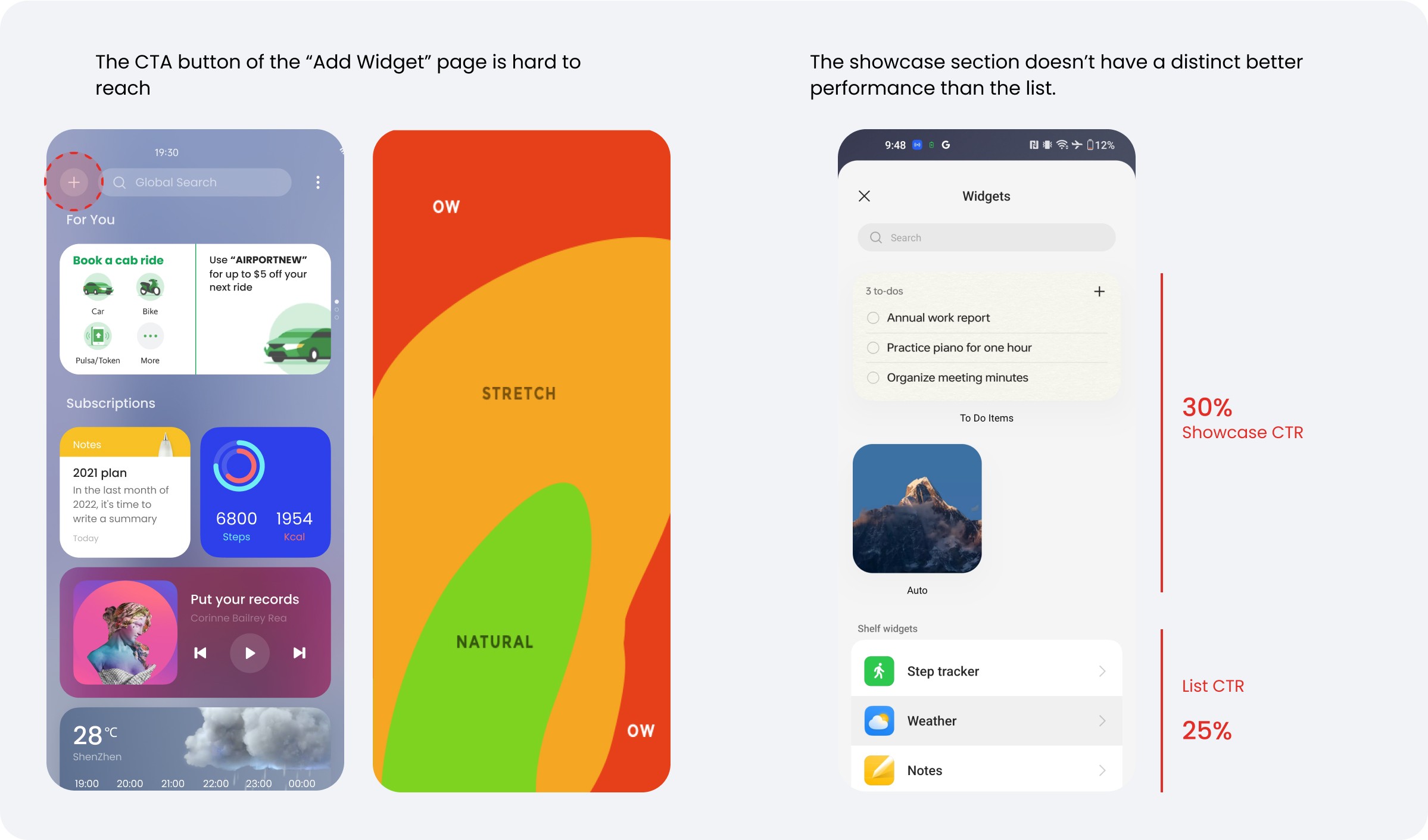
Reviewing the UX design, “Add Widget” page was difficult to access, and the prominently placed showcase section within the page was underutilized and failed to deliver substantial user value.
Problem Define 3
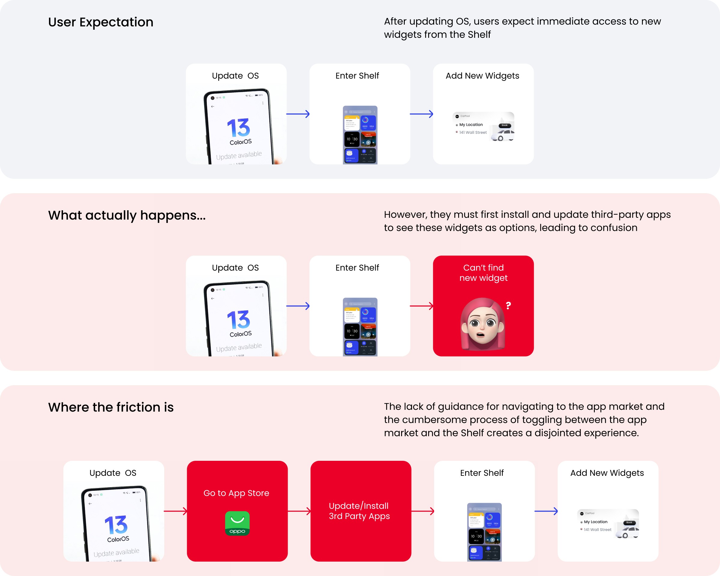
Mapping the critical user journey, users may struggle to find the newly launched widgets as they must install and update the apps beforehand.
Problem Define 4
It was challenging to attract third-party service providers to participate in the widget ecosystem, because widget, as an add-on to the native app, did not contribute to user conversion.
Widgets Ecosystem in China
65+
Partners
Widgets Ecosystem in Global Market
1
Partner
Our main objectives:
Acquire new users and incremental orders from them and/or
Acquire new membership subscription and retain them
— Ridesharing Partner in EU
We have very limited development resources. Widget is an add-on to our app that only benefits existing app users. Leads to new app download means an incremental for walk-in cases.
— Logistics Partner in SEA
It’s hard to build partnership from scratch. We need to consider our partner’s need for user acquisition. And that will also bring us business benefit.
— Strategic Partnership Manager, BD at OPPO
Competitor Analysis and Inspiration
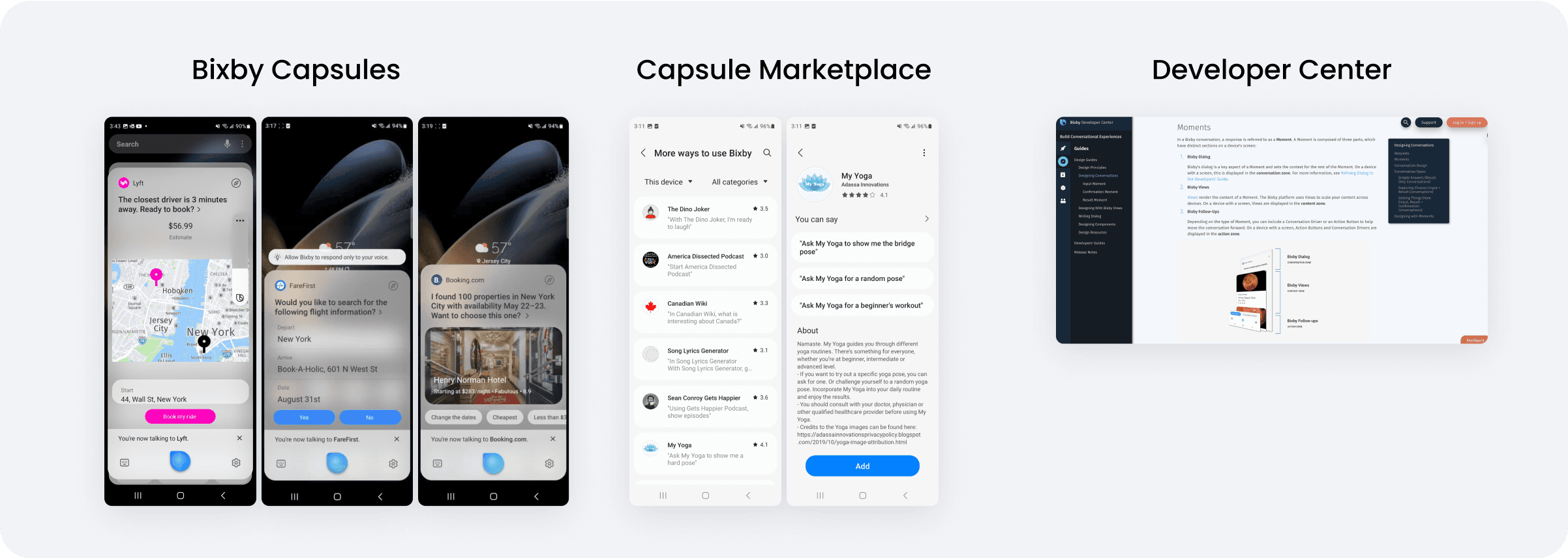
Samsung's Bixby Marketplace
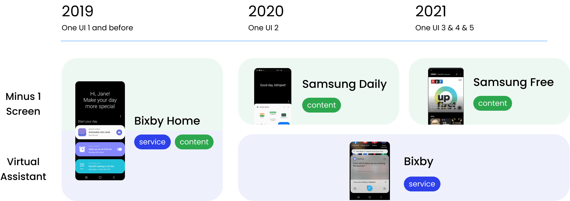
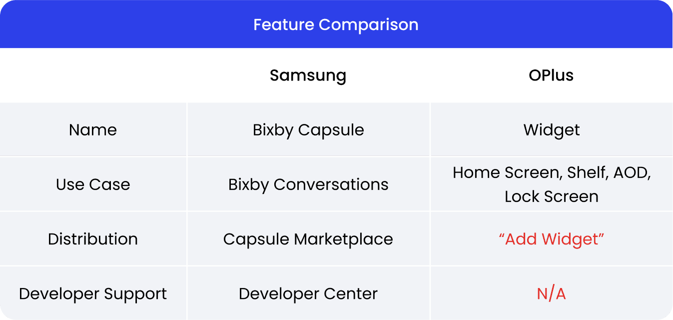
In my competitor analysis, Samsung's Bixby Capsule Marketplace stands out. Launched in 2019, Samsung's "Bixby Home" serves as the core interface for its Bixby virtual assistant. It employs widgets, known as Bixby Capsules, to offer personalized services and content recommendations. Bixby Home has progressively transformed into a media content hub, with Bixby evolving into a unique and standalone feature. Throughout these changes, widgets have continued to be essential for user interaction and accessing services.
To enhance Bixby capsules' capabilities and attract more partners and developers, Samsung established a marketplace for distributing these services. Additionally, they developed a platform offering technical support to developers, further nurturing the ecosystem.
Compared to Samsung, our widget lacked a clear vision and effective distribution. I proposed:
Refine Shelf positioning and structure, and form key partnerships.
Redesign the "Add Widget" page into a user-centric marketplace.
Improve developer support by expanding and translating documentation and guidelines.
Product Planning
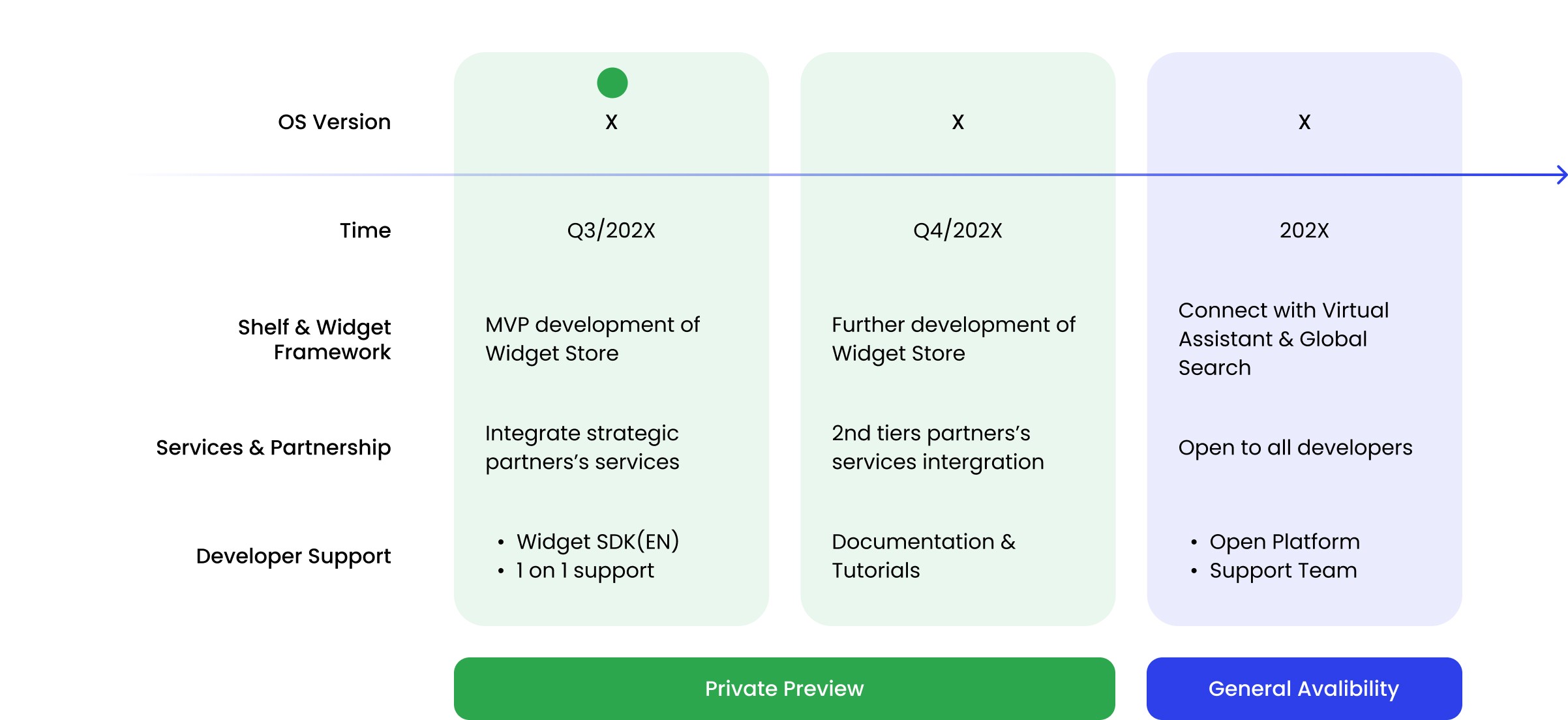
Defined the product vision of Widgets Store and plan the development roadmap
Addressing all the problems we find from user experience design, user journey, and ecosystem development, I worked with stakeholders to plan the future development of shelf and widget from 3 aspect: Shelf&Widget framework, Partner&Services, and Developer support.
* See how I established the partnership model HERE.
MVP Goals
Given limited development and operational resources, we aim to concentrate on a basic widget store framework that satisfies user and partner needs, utilizing minimal resources for rapid iteration.
Design Guided By Vision
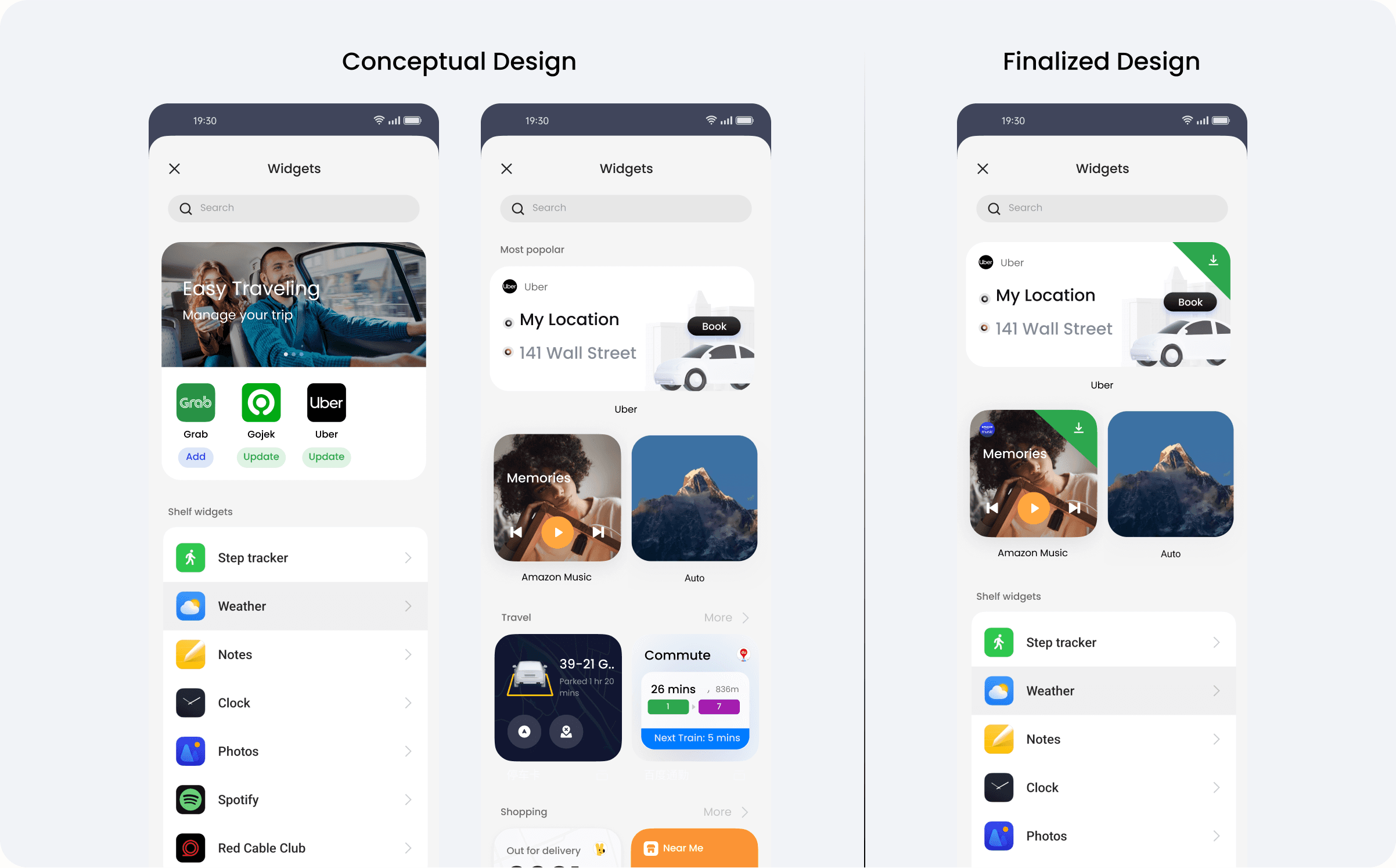
Guided by our vision and MVP goals, we're aiming for a simple, user-friendly initial design that subtly introduces a marketplace structure. After exploring multiple concepts in workshops, I chose the design most aligned with our vision.
Design Approach
The creation of Widget Store
Design Update 1
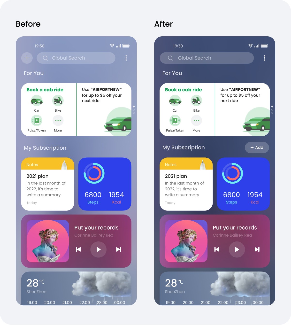
Enhance the CTA button of Widget Store
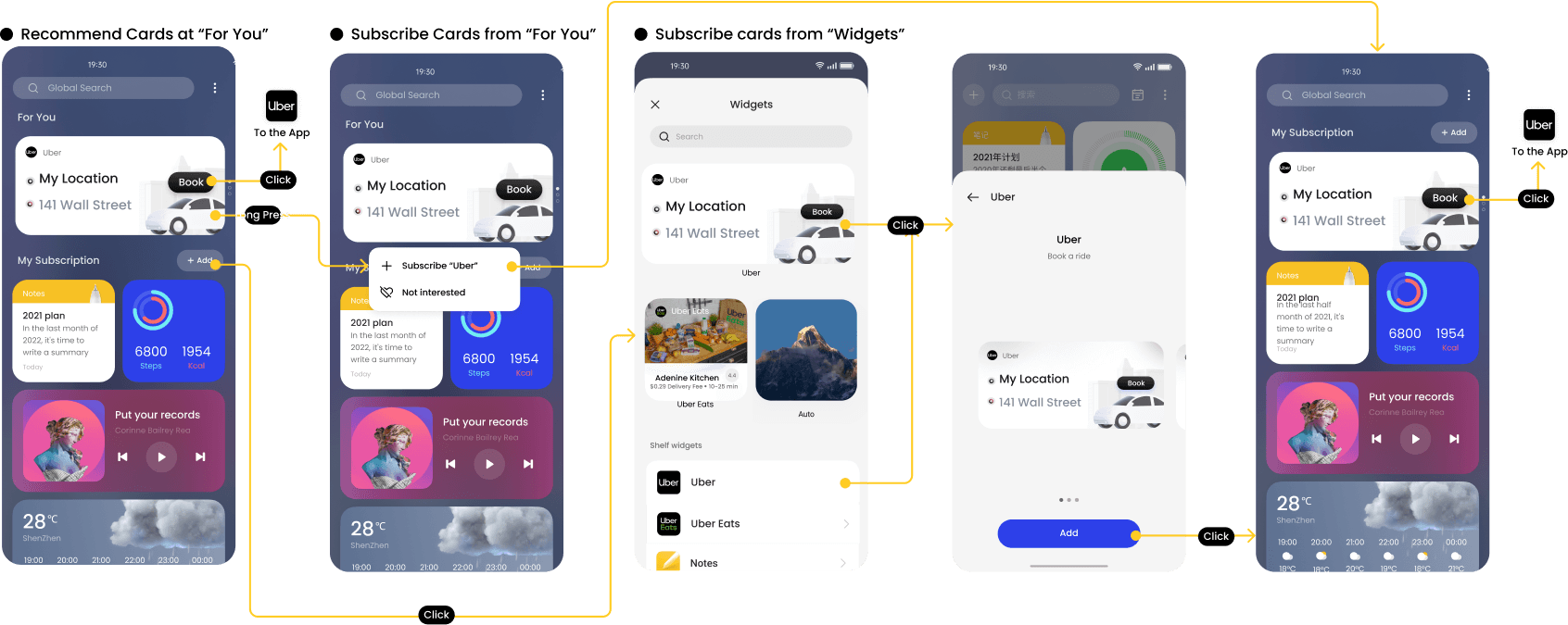
Placing the action button to a more accessible place on the screen, and closer to the "Subscribed Widgets" session to rise awareness and drive more traffics.
Design Update 2
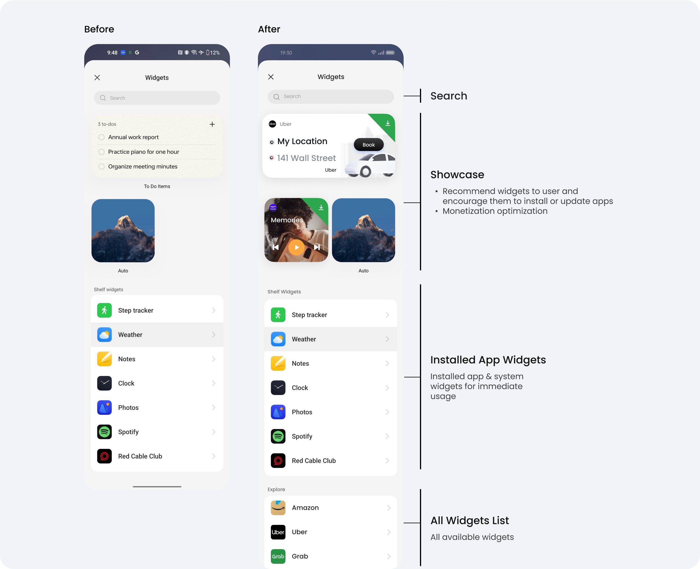
Change the “Add Widget Page” to a “Widget Store” marketplace
NEW Product Features
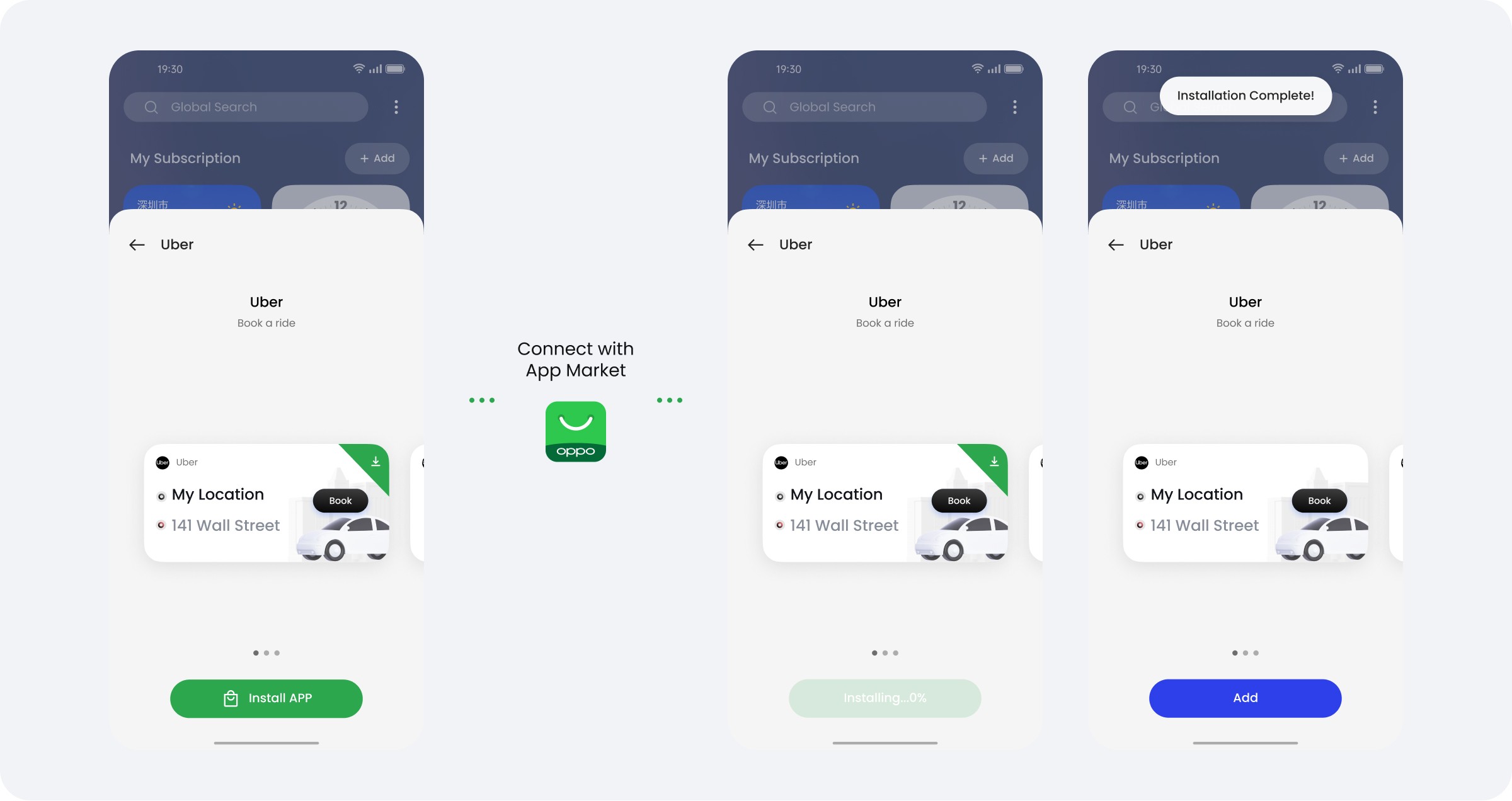
Enable app update and installation directly from Widget Store (Work with the App Market)
Collaborated with the App Market team, we enable app installation and update directly from Widget Store, creating a friction free experience.
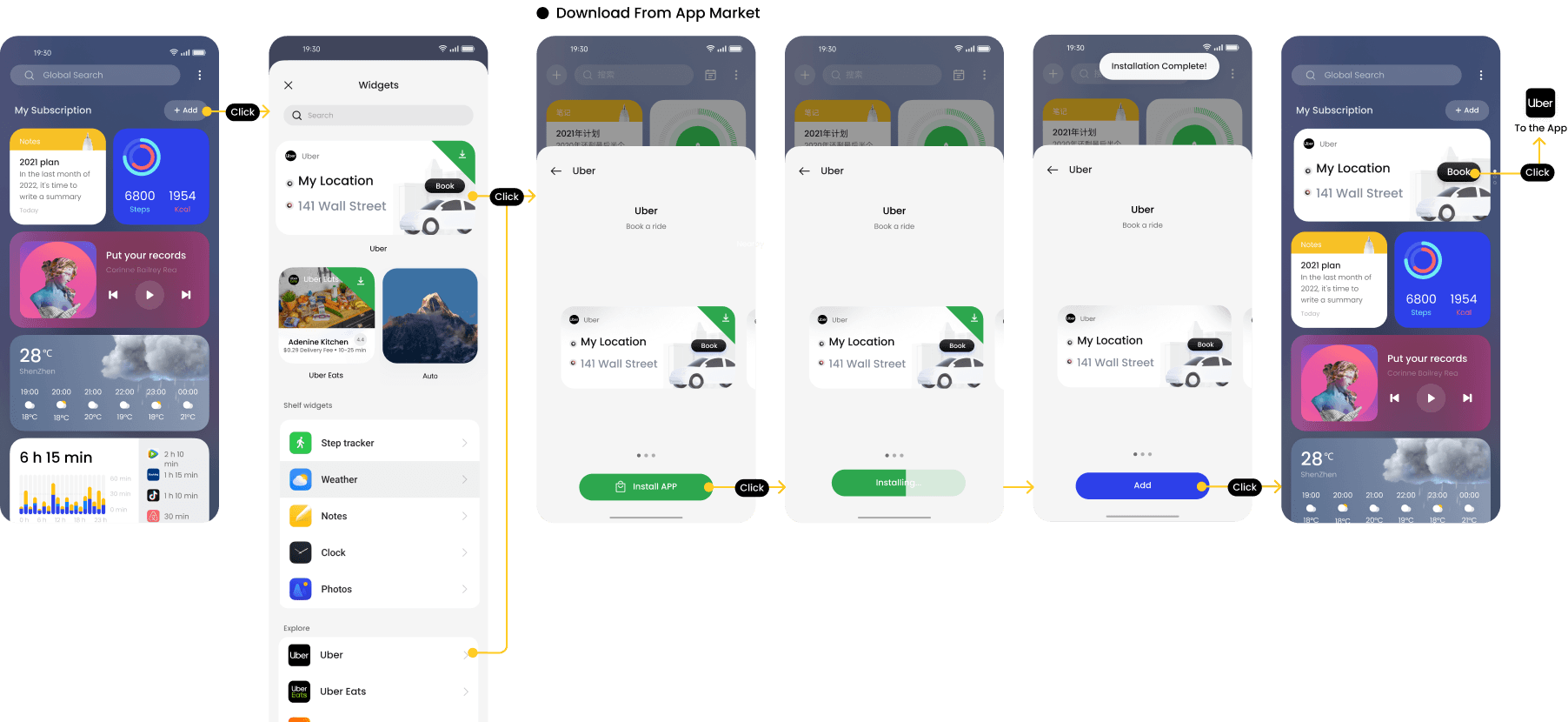
User Flow 1
Promoting App Recommendations > install base conversion
User Flow 2
Use installed App Widget
User Experience Improvement
Resolving the user journey blockers: streamline explore, subscribe and use widget experience
Business growth
Marketplace - A proven path to monetization
Widget Store Annual Recurrent Income
X
million
*Initial release scope
