I turned an impossible partnership into success
Led the pitch for a partnership with the world's largest e-commerce company.
Collaborated with internal and external stakeholders on complex problem-solving.
Designed three partnership proposals, balancing user experience and business goals.
Successfully established the partnership.
My Role
Product Manager, Product Designer - Global Product Planning
Broader Context
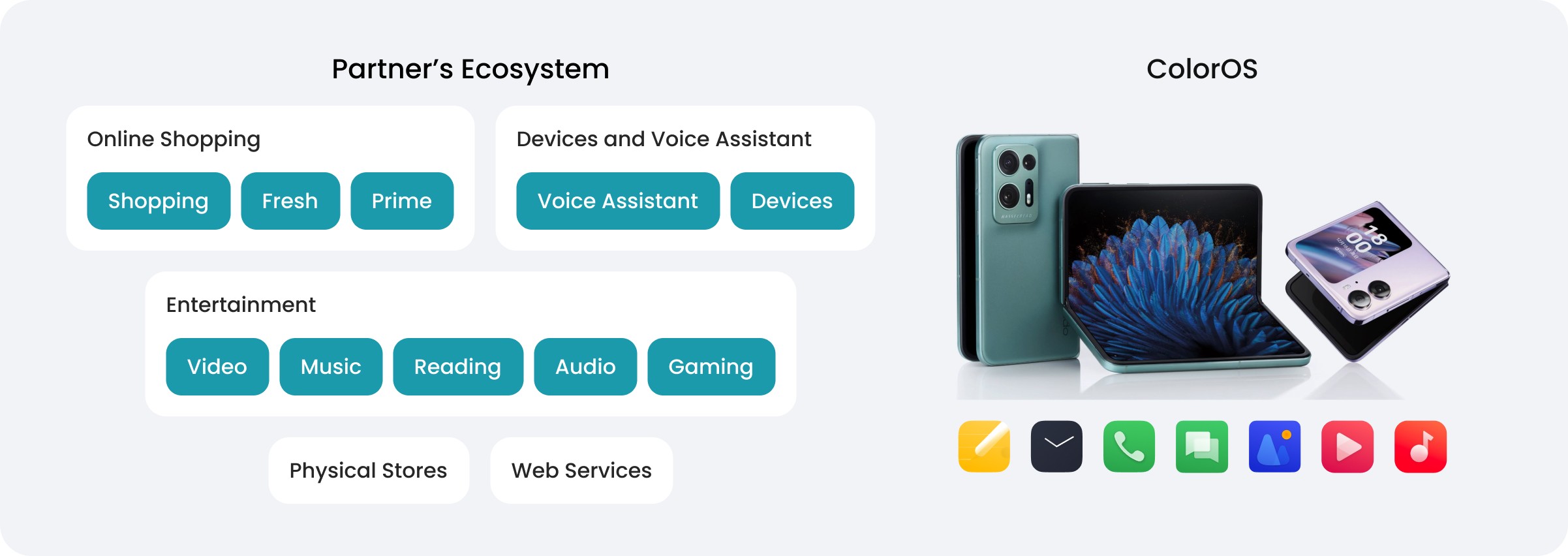
Build ColorOS Ecosystem with Service Partnerships
To offer tailored local services to users, establish a strong ecosystem, and stimulate business expansion, we are developing foundational product partnerships for ColorOS.
Project Goals
Partnership pitching to the world’s largest online shopping platform
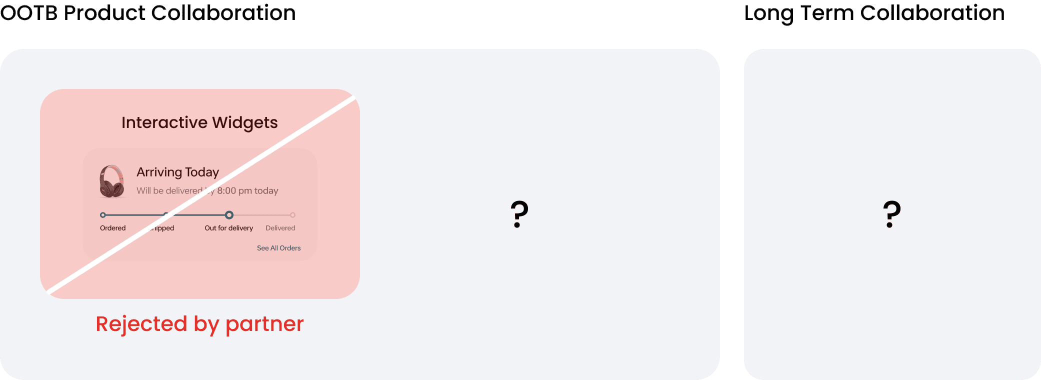
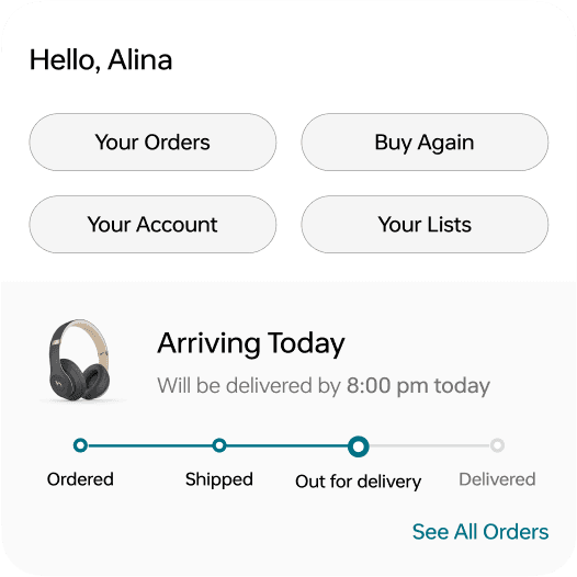
Despite multiple attempts to propose the integration of an interactive widget feature, our team has consistently been turned down by the partner.
My goal is to refine the product concepts to establish a strategic partnership. This will require redesign of the existing proposal and discovery of new opportunities.
Challenge 1
A mismatch between the partner’s business goals and our product proposal
I conducted an in-depth analysis on our widget interaction strategy and talked with various teams involved in the project to pinpoint the critical reasons for our proposals being declined.
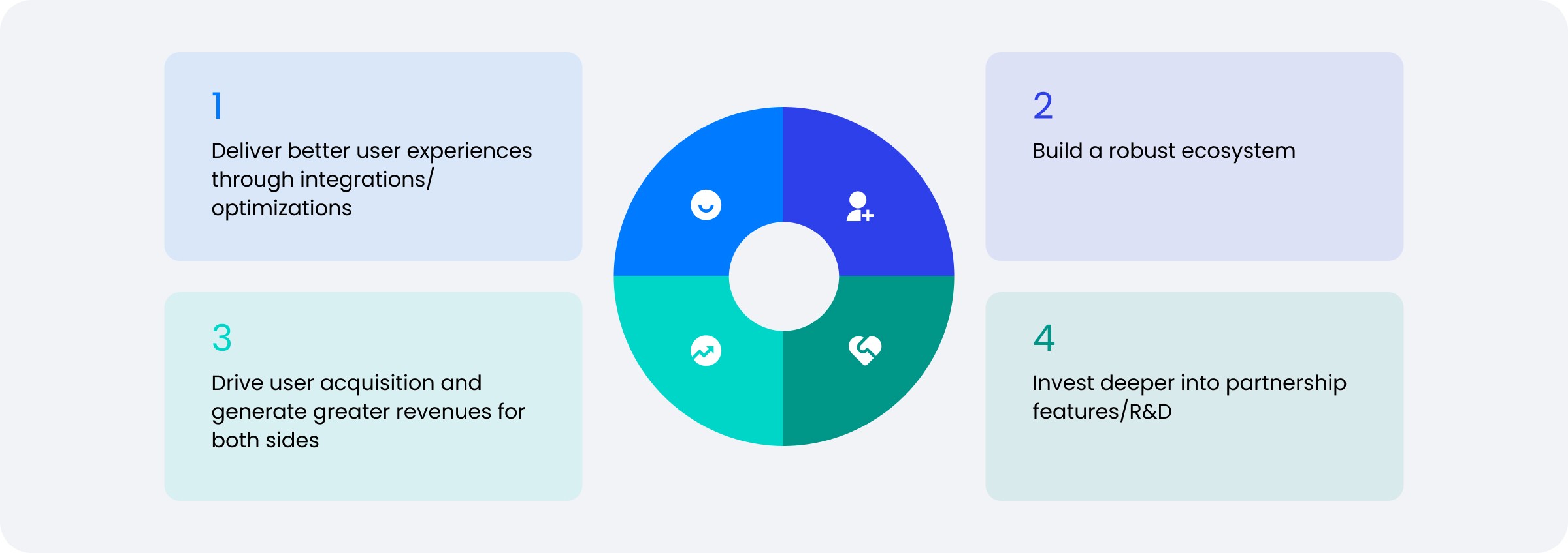
Partner’s Business Goal
New User Acquisition
Order Convention
Membership Subscription
Our Product Proposal
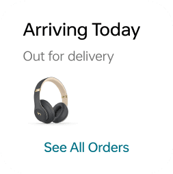
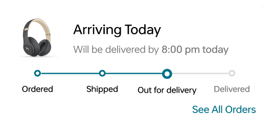
Our product proposal, focused on post-purchase services such as order tracking, does not align with the partner's primary business objectives.
Design Approach 1
Aligning product proposal with business objectives, enrich widget content to provide more user value and drive growth
Enrich widget content
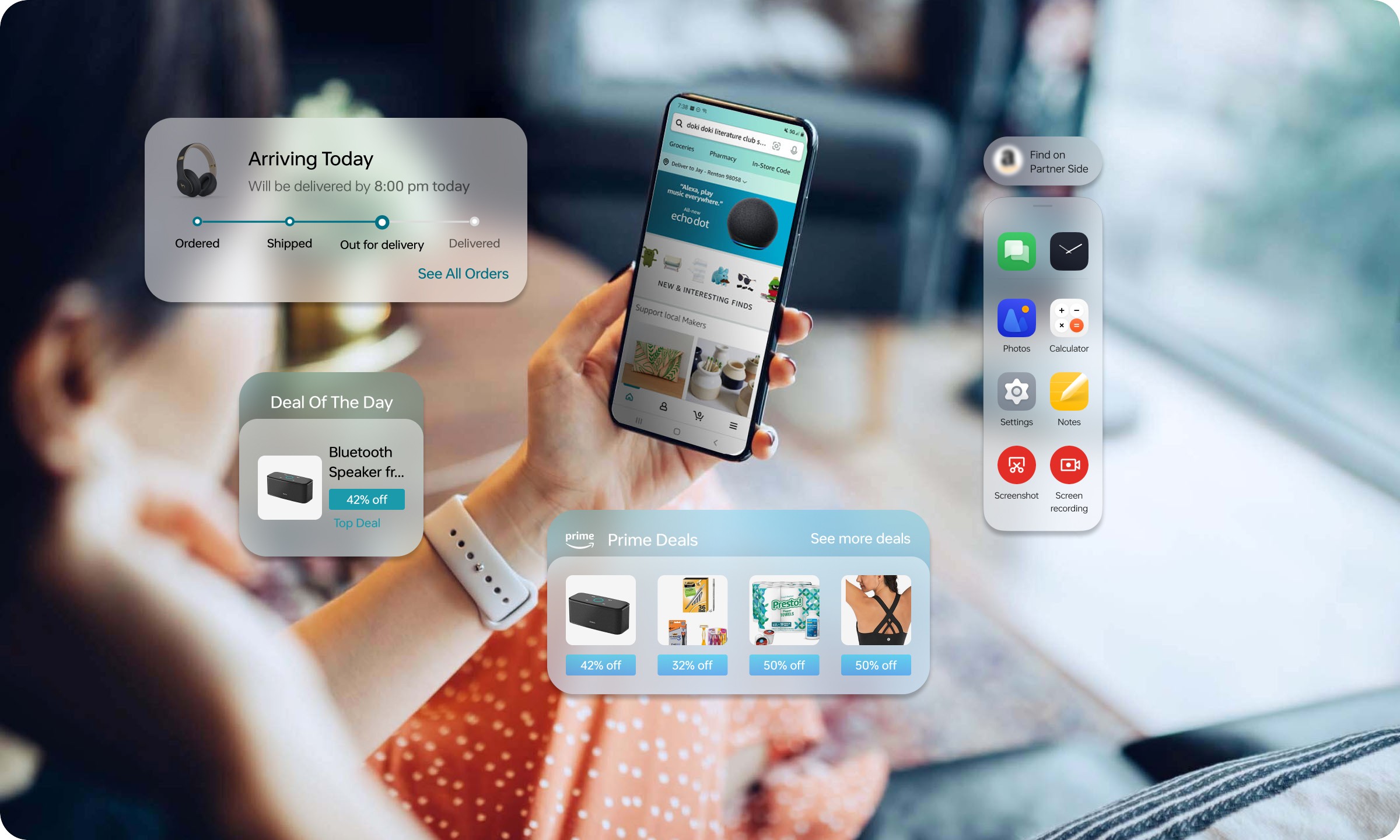
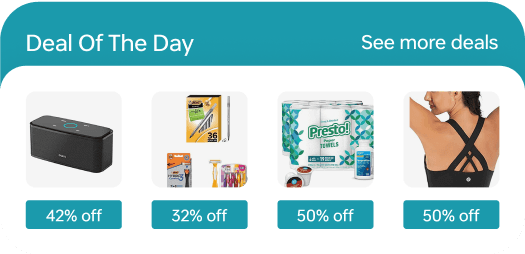
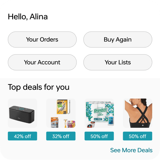
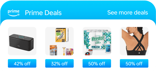
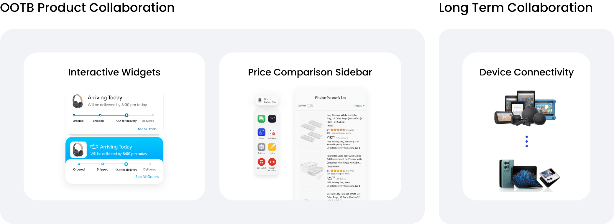
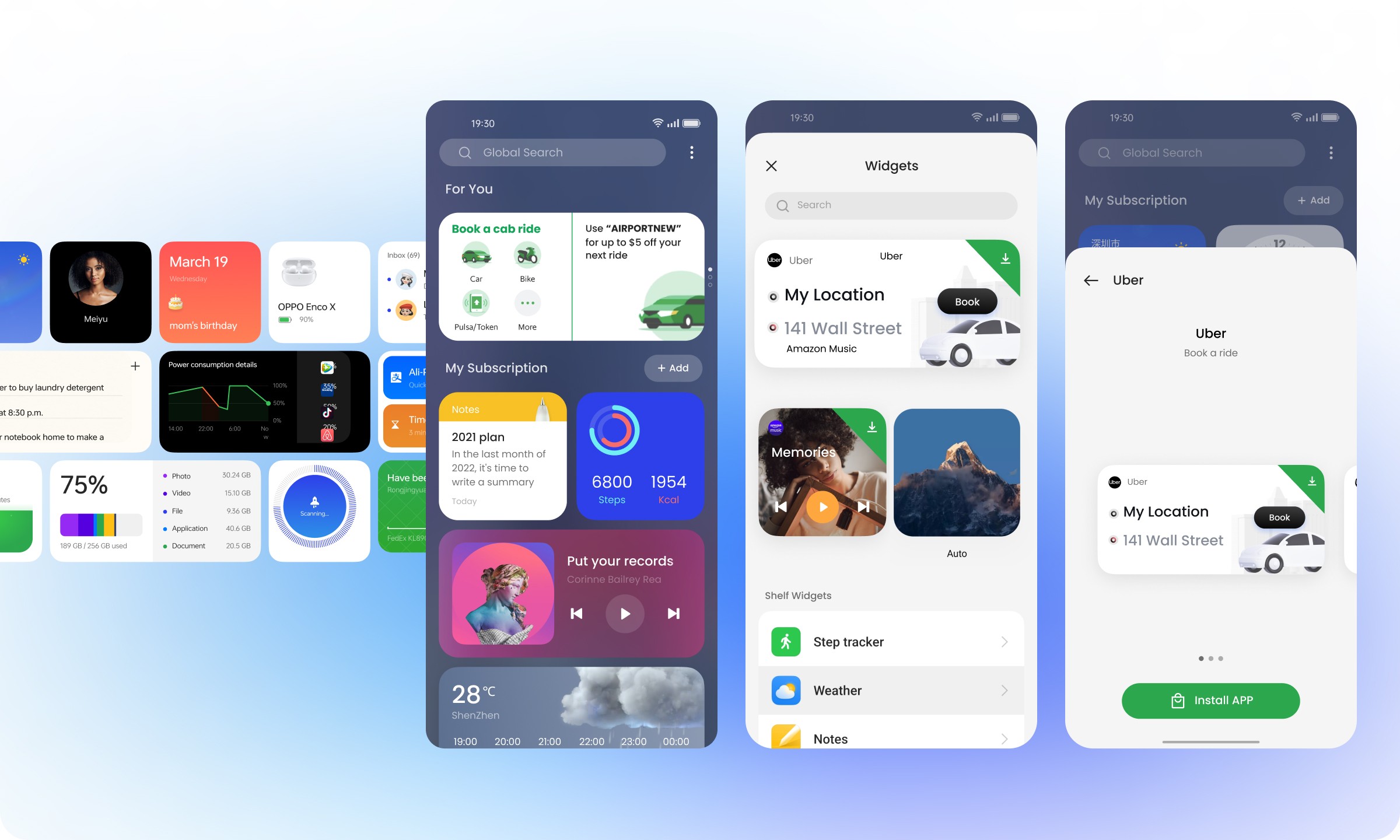
I expanded the widget content beyond post-purchase services to include pre-purchase personalized content that boosts order conversion and offers customized recommendations to users.
* Mockup Demos
Member Exclusive Widget
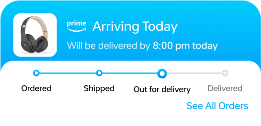
Additionally, I integrated a new product concept featuring exclusive Prime member-only content, such as widget customizations and special deals, aimed at increasing membership subscriptions.
Regular Widgets
Prime Member Exclusive
Default Interface
Enable Customization
Regular Deals
Exclusive Deals
Design Approach 2
Built the mvp of the Widget Store for immediate user convention
The Widget Store enables new users to browse and download widgets freely, 2X widget exposure and drives user convention.
* See a case study of the Widget Store creation HERE.
Challenge 2
Partnerships are just like dating. we need more attractive, innovative immediate proposals to captivate our partners and initiate conversations.
Compromising user experience for partner benefit? No
While exploring partnership opportunities, another team suggested introducing "lock screen ads" to promote partner services. Recognizing the potential detriment to user experience, I opposed this approach.
Revisit User Journey
Are there unmeet user needs in mobile shopping? Yes
I analyzed user research reports and data, uncovering a prevalent behavior across key markets: users consistently compare prices before online purchases.
in US
82%
of consumers compare prices before making an online purchase.
*Source: Statista
In Southeast Asia, users prioritize
smart price comparison
when shopping online, as our reports indicate.
*Source: Internal user research
In Europe, consumers evaluate both
price and delivery options
before ordering.
*Source: Statista
Our research highlights a pain point in navigating multiple shopping apps to compare prices, presenting an opportunity for OS to enhance the user experience by simplifying this process.
Design Approach
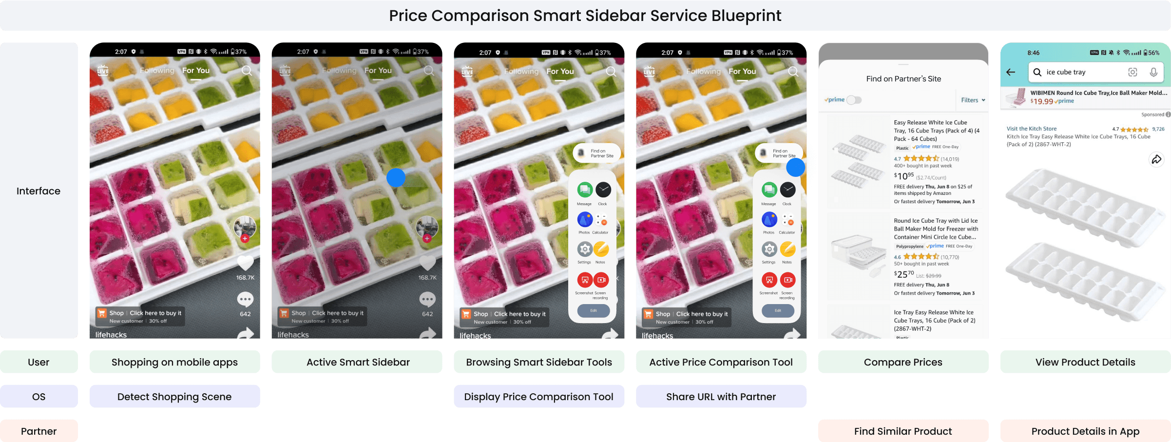
Synthesizing user needs, partner requirements, and OS functionality, I proposed a partnership to embed a price comparison tool within the sidebar
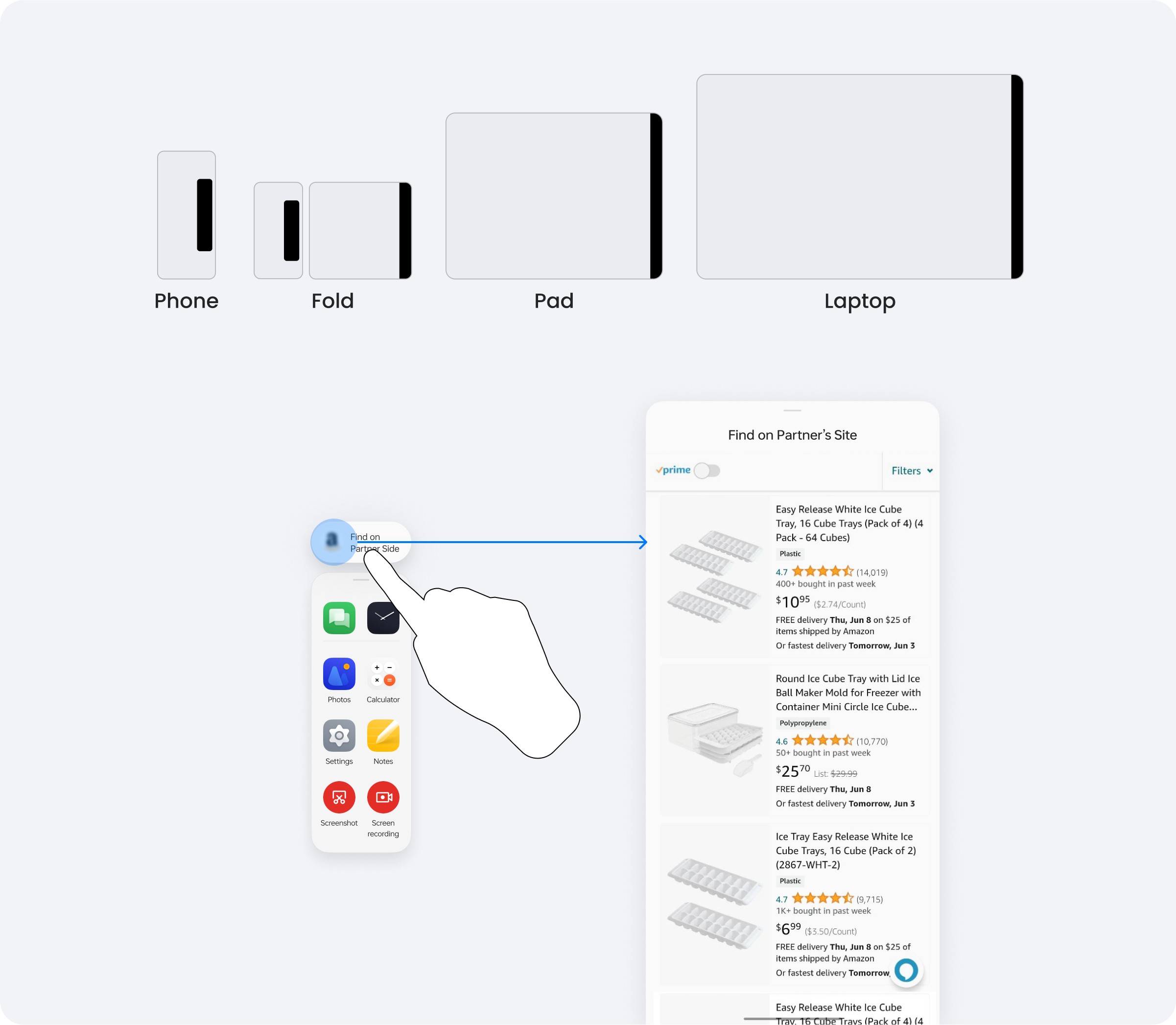
Upon reviewing the OS features, I identified the OPlus Smart Sidebar as an ideal solution for price comparison. It not only streamlines multitasking by simplifying the switch between applications but also provides assistance with the user's current task. And it is compatible with all our devices, including foldable phones and tablets, with the capability to invoke split-screen.
Developed a service blueprint detailing the services and support structure for intricate collaborations
Challenge 3
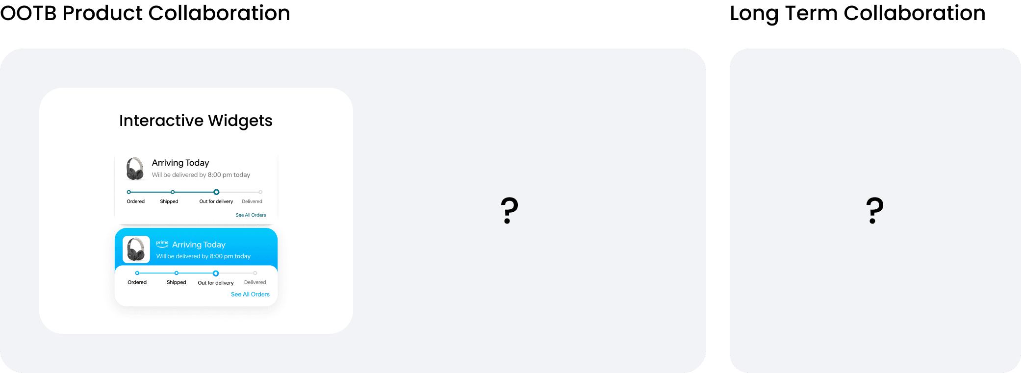
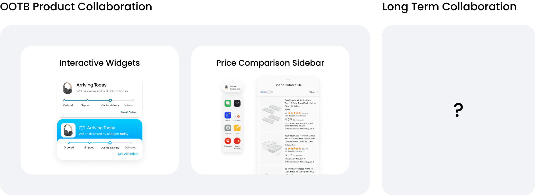
Longer term partnership idea consideration
Business objectives and Stakeholder Interviews
To identify our shared long-term objectives, I engaged with stakeholders and conducted thorough analyses of both our and our partner's business models, product visions, strengths and weaknesses
Long Term Partnership Vision
Build a cohesive ecosystem together
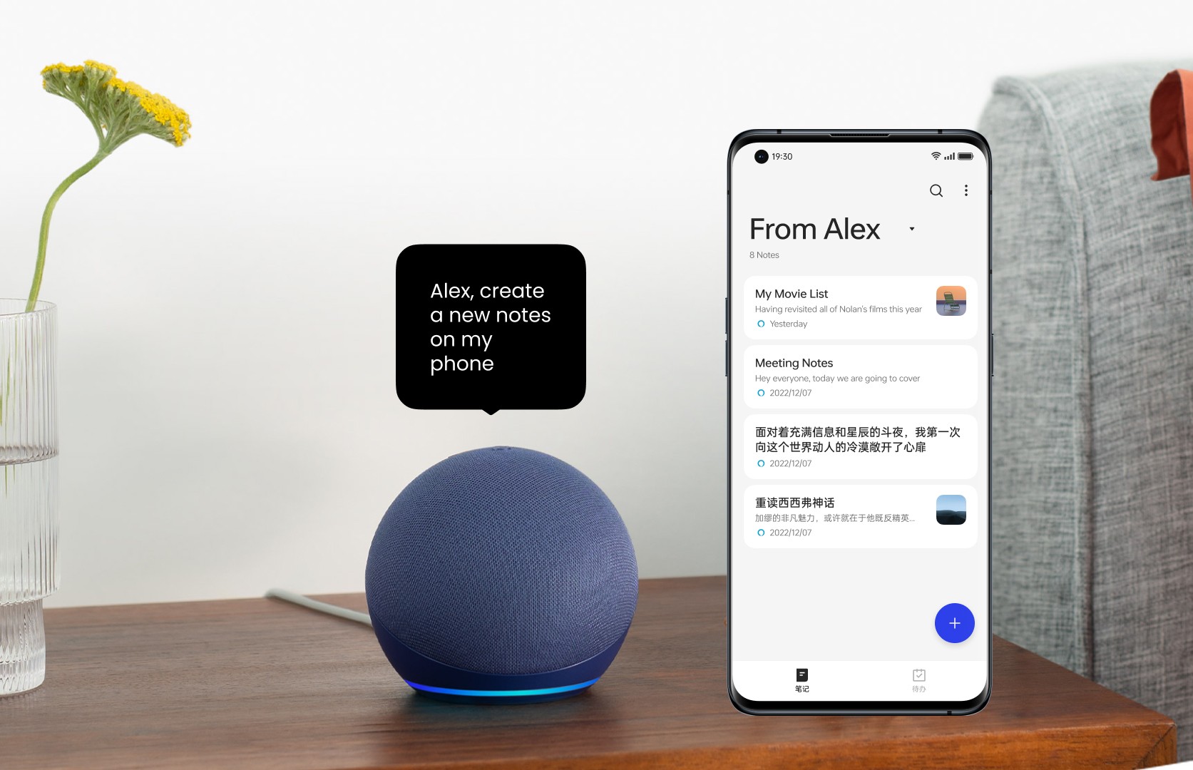
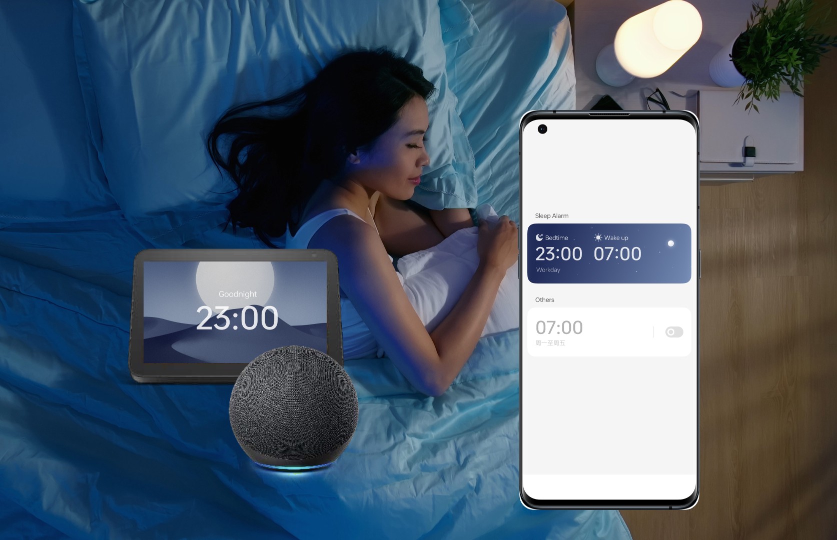
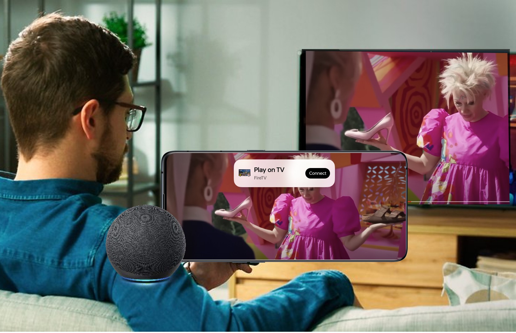
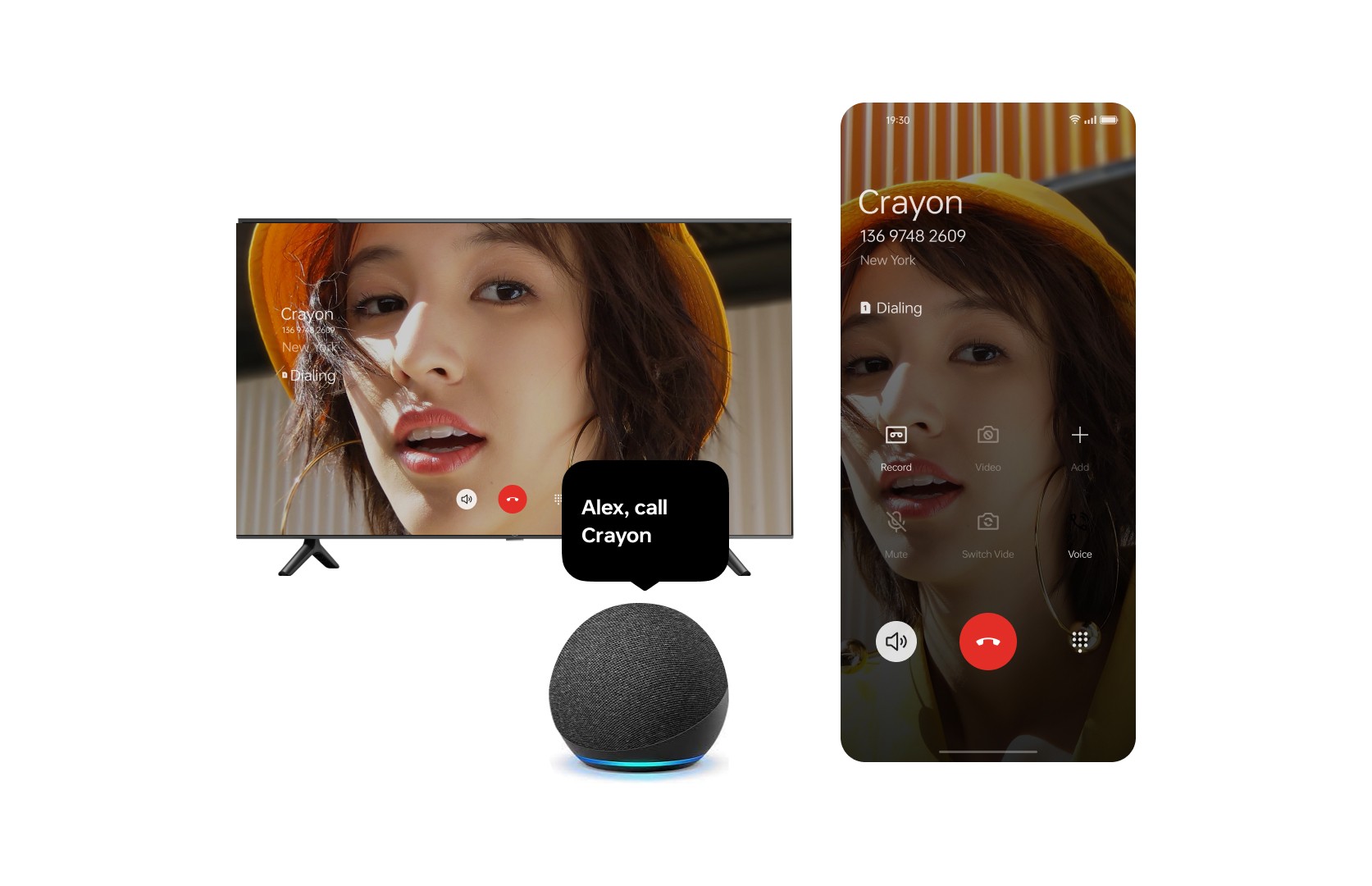
Our joint goal is to establish a robust ecosystem encompassing devices and software. By enabling device connectivity and continuity, synchronizing accounts, we can craft a seamless user experience across all devices.
I created mockups and demos to visualize the product vision. Planned and prepared workshops for further conversations.
Result
Established Fundamental Partnership
With the revamped partnership proposal, we successfully pitched to our partners and engaged with their product teams. They have incorporated the price comparison sidebar into their product planning.
Afterwords
Unfortunately changes in leadership direction paused development on this project assignment.
This experience, however, remains a cherished chapter in my journey of product partnership. We poured our passion into nights and days of research, spirited brainstorming, and meticulous refinement, ultimately forging a proposal that elegantly balanced user needs with business directives.
I hold dear the pride of being the voice of global users at OnePlus/OPPO, and look forward to see where the design land in the future.
