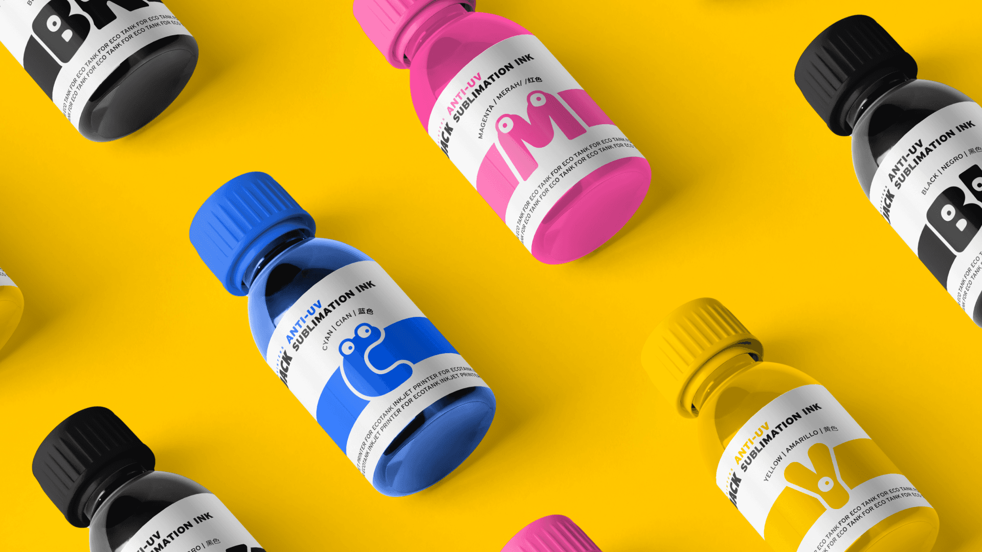


Printers Jack, a global sublimation printing supplies brand, is undergoing a vibrant transformation. This includes a new logo, bold colors, typography, bespoke illustrations, and patterns, resulting in recognition like the 2021 GDUSA Inhouse Design Award, Davey's Award, and C2B Communication Design Award.
Printers Jack, a global sublimation printing supplies brand, is undergoing a vibrant transformation. This includes a new logo, bold colors, typography, bespoke illustrations, and patterns, resulting in recognition like the 2021 GDUSA Inhouse Design Award, Davey's Award, and C2B Communication Design Award.
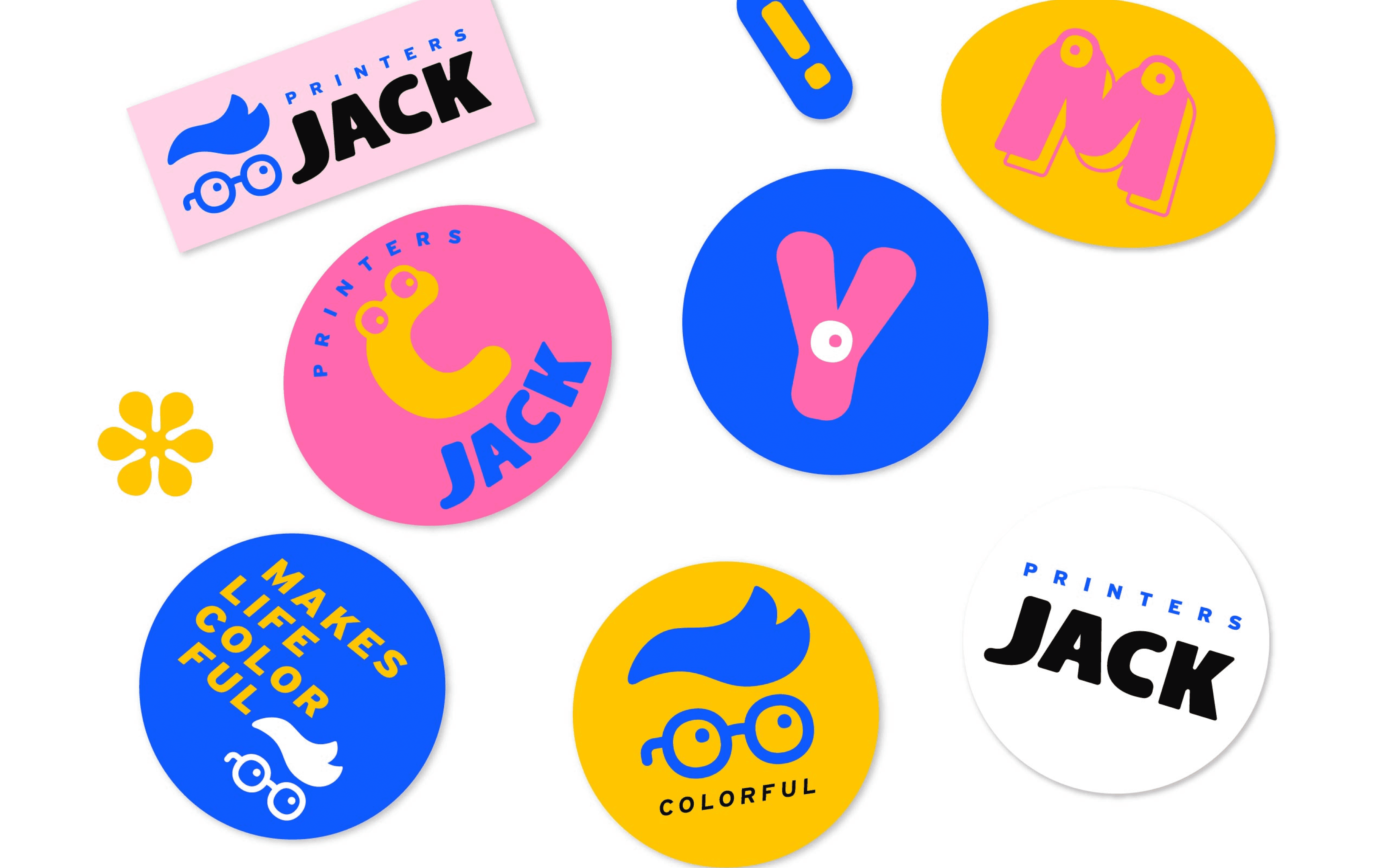


During the discovery phase, I immersed myself in understanding Printers Jack, a new brand in the printing supplies market. Conducting thorough research into the brand’s history, industry, competitors, and audience, I identified key insights for differentiation. By engaging with customers, I discovered what they valued most and used these insights to shape the new design strategy.
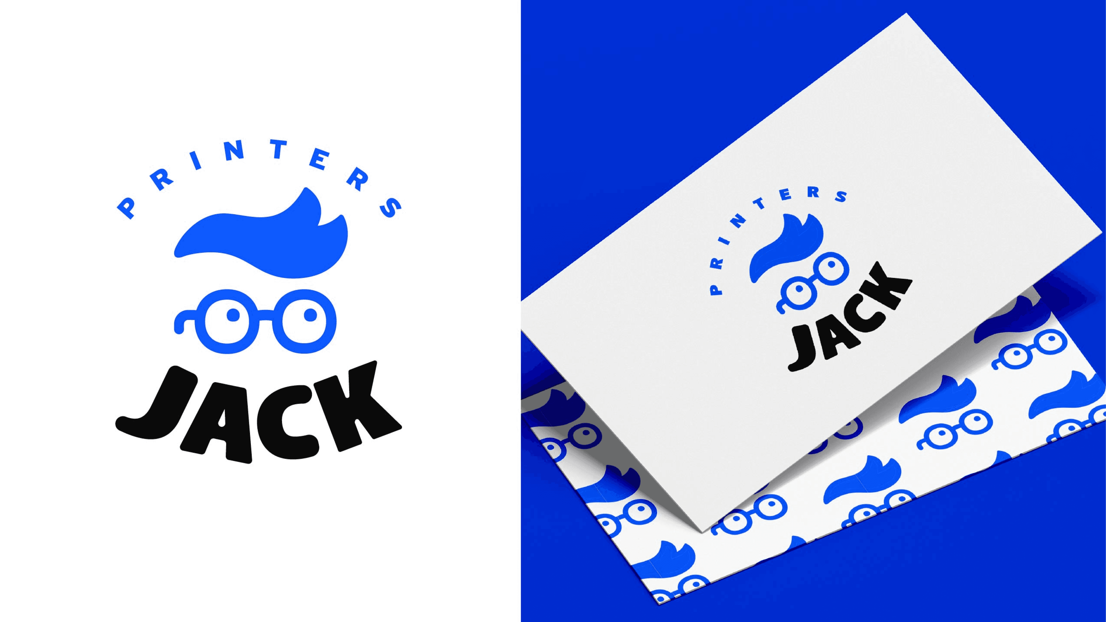
I revitalized the logo, introduced a striking color palette, updated typography, and created unique illustrations and patterns to deliver a fresh, dynamic, and cohesive visual experience. Modernizing the logo with playful aesthetics, balancing CMYK-inspired colors, and designing original illustrations highlighted the creative possibilities of Printers Jack’s products. These updated guidelines were applied to new packaging designs, breaking away from the conventional look of traditional printing supplies. Throughout the project, I ensured all new designs aligned with the refreshed branding, creating a cohesive and captivating brand presence that resonated with consumers.
year
year
2021
2021
timeframe
timeframe
2 month
2 month
Client
PrintersJack
category
Branding
Client
PrintersJack
category
Branding
01


02


03
